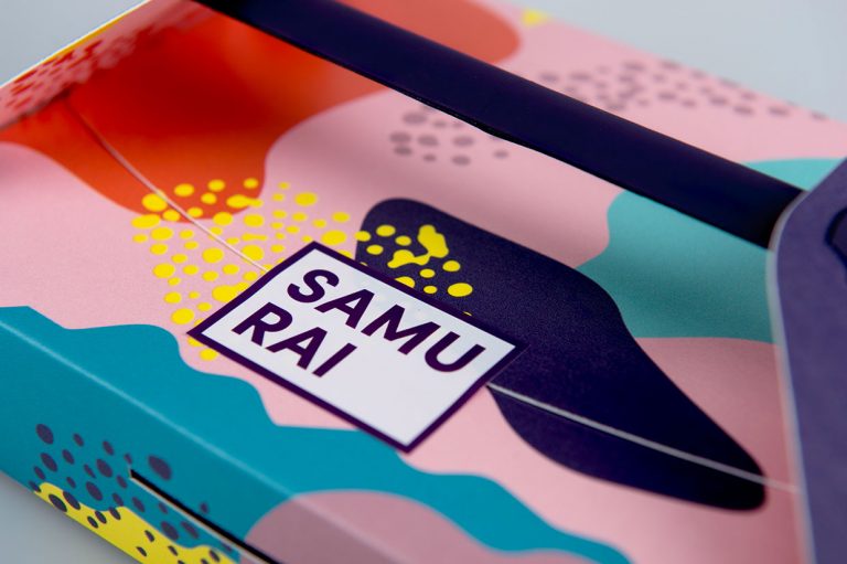
It’s not always easy to combine fun, eye-catching product packaging with convenience and practicality for a restaurant concept. However, when the two come together you end up with one of a kind design that can become a restaurant concept’s signature style.
The brand and packaging design created for a restaurant concept by a group of Swedish design students sees functional and playful designs take center stage with the use of playful and colorful designs used as an homage to Japanese art and culture.
The design sees a wide array of colors used in various shapes and patterns.
These patterns still maintain a controlled and balanced composition by keeping most of the larger color sections in pastel pinks and purples so that the busy pattern and bolder colors don’t overwhelm the viewer with too much to look at.
With all of the colorful chaos occurring on the packaging, the brand is balanced out by its use of a simple typeface.
By using a classic sans-serif font on blank white or light pink backgrounds to relay the restaurant concept’s name and the menu’s item information, the brand is able to display important information about the brand to the viewer without having to worry about the energetic visuals on the external packaging.
The structural design of the carry-out containers was made to help make the consumers life much simpler.
The boxes contain handles at the top of the containers along with slots on the sides so that the customer can stack their numerous boxes of food, latch them together, and carry them in one hand with ease.


