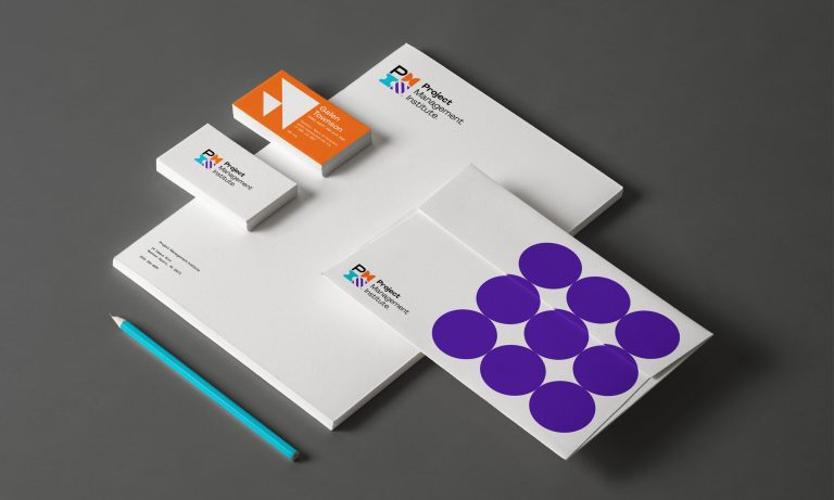
Take a look at this new Project Management Institute brand identity created just in time for PMI’s 50th anniversary.
The new identity (designed by Superunion) sticks to the practical layouts associated with corporate businesses but jazzes it up with vivid colors and quirky icons that help set the company apart from others of its kind.
Each icon is color-coded and assigned a word that ties into the qualities that define the company, making it a one-of-a-kind, puzzle-like legend that can be made into different combinations and applied to different branches of the company itself.