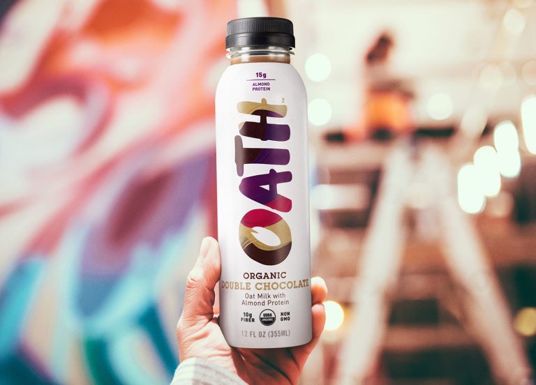
Take a look at this identity created by B&B Studio for the new Oath oat milk branding (by B&B Studio), which features a design that is both functional and eye-catching.
The lively and organic typeface instills a sense of bold individuality and expression that helps set it apart from other branding styles of similar ilk.
The vibrant patterns placed within in the brand name offer a quirky, and immediate flavor distinguishing effect without overpowering the important product information surrounding it.