When it comes to a small-market team like the Milwaukee Brewers, identity needs to be refined & clear.
Baseball is considered an iconic sport in the United States and is often referred to as “the American Pastime”.
With this nostalgic tagline forever adhered to the sport’s image, it can be hard to evolve a team’s look without losing the classic look and style that fans had come to associate with the brand.
This was the task that the members of the RARE Design studio were tasked with when it came to re-branding one of the oldest baseball teams in America.
The design team approached the rebranding by giving previously used and retired images and icons of the brand a modern-day refresh.
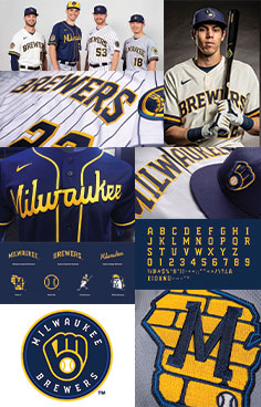
The team’s main logo was changed by making the “Milwaukee Mitt’s” baseball center a true representation of a Midwestern staple; wheat.
By making the wheat baseball the true center of attention, the brand created a new and better icon for the team and the Midwest as a whole
The Milwaukee Brewers identity also stuck with a lot of the brand’s familiar icons, like the Milwaukee State Art, and gave them a 21st-century update with the use of more colors and a more clean and vectored artwork style.
The traditional sports-serif font style and the tam’s modern heritage word mark were customized and cleaned up by the designers to help create a fresher and more sleek word mark for the team that will stand-out and compliment the team’s variety of uniforms.
This Milwaukee Brewers identity re-branding blends together the old-school familiarity of baseball but modernizes it for today’s target audience.