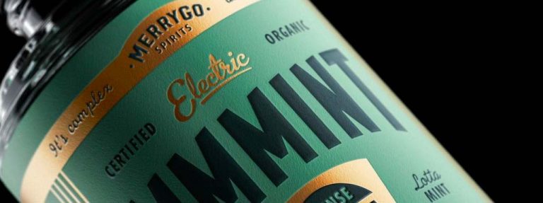
This packaging design from MerryGo Spirits takes us back to the classic Victorian elements of style and design.
Using multiple, varying fonts for different sections of information, the brand manages to create a cohesive layout that grabs the viewer’s attention without losing them to the chaos of the numerous typefaces & information.
Each spirit flavor’s packaging (designed by Canales & Co.) follows the same layout as one another but varies on color scheme depending on their flavor, creating a united design theme that still distinguishes products from one another.


