A brands name can be just as important to its identity, packaging design, and its overall outward aesthetic. The mock Harbor Crafts “company” was designed by Chargefield for Adobe to help showcase Adobe’s program called Adobe Dimension.
The Harbor Crafts Company sells high-end accessories for men which includes belts, cuff-links, shoes, and especially ties.
The designers made a sleek and simple creation that reflects the brands products, and the brands name.
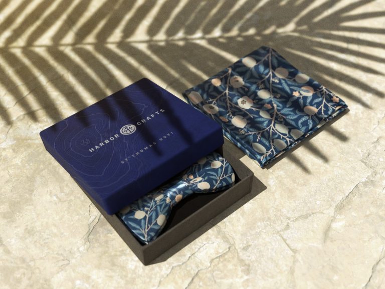
The Harbor Crafts logo is a bold and heavy-set, serif typeface that is split apart by the brands icon. Usually when this is done, it can break up the brands name too much and can distract the viewer from important information. That said, the icon is bold like the logo’s accompanying typeface.
It contains a blended “H” and “C” that are joined together through different sections of an anchor. This ties in the “harbor” theme perfectly & is set in a gold foil-stamp print. The foil pops and breaks away from the neutral navy background of the box.
The dark, navy blue background symbolizes the dark ocean and contains a faint, rippled, organic lines which represents the different levels of the ocean floor.
While this brand and packaging was only made to display Adobes different design systems, this identity was so well done that it makes you wish that the brand and its products existed in real life.