This Guta Café rebranding is a perfect example of showcasing one’s culture. This relates well to the general public, while also supplying their goods and services. Guta Café provides strong Vietnamese “street- coffee” which has become a foundation to the country’s local culture.
Many brands choose to focus on only displaying their message and purpose through their packaging. Others choose to let their country’s culture and style shine through their packaging. Moreover, their identity designs show and relate to the local community who will be consuming their products.
Guta Café Rebranding Background
Guta is Vietnamese slang that combines the French word “Gu” and the Vietnamese word “Ta”. When the two are combined, it translates to “our style”. Guta Café’s style is a unique and one-of-a-kind style that is reflected throughout the company’s branding in a way that reflects multiple Vietnamese pop culture icons.
The Guta Café rebranding design style (made by M — N Associates) contains a vivid bright blue and yellow color scheme. The basis for the scheme is modeled after the Vietnamese Social Security propaganda poster that became a recognizable image from Vietnamese culture. The goal was to represent the poster’s message which was “a friend of every worker”.
Merch
The images printed on their coffee cups are modeled after the half-tone printing style. The half-tone texture is used for newspapers and fits within that propaganda posters message. These visualizations were meant to act as a bridge that connects different people, from all walks of life who come together to sit down and have a cup of coffee with their morning newspaper.
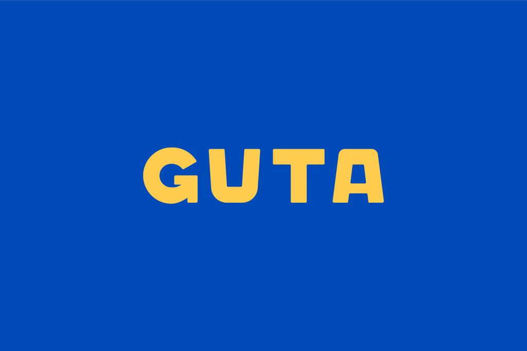
Typography
The typography that is used for multiple components of the brands items is reflective of the commonplace font that is used across multiple forms of media throughout Vietnam.
The Guta brand identity shows the best of what Vietnam has to offer and is a cultural mainstay for the country and its residents.