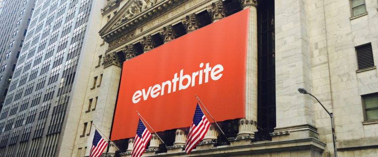
For an events-based company like Eventbrite, branding has to be on-point. The updated Eventbrite Branding shows the importance of cohesiveness, with the help of Moving Brands.
Even in this weird, COVID-19 ridden world, events are still very much a thing. Many publication-forward brands (particularly blogs) make their money on in-person events. With their marketing talent, I’m sure they’ll figure out how to hold events in this era of social distancing.
Anyway, back to the Eventbrite branding review.
The refresh is largely typographic in nature, but there really isn’t any one thing that unites the brand together.
Typically, brand refreshes have something that pulls everything together. There is always one element that you can look to and say “this is what brings everything under one roof.”
There really isn’t that one combining element, unless you really stretch it to say it’s the Eventbrite staple reddish orange. Looking at the poster imagery & even some interfaces below, that orange isn’t there to pull them together.
That said, everything feels cohesive. There isn’t one brand language northstar. Instead, there’s a combination of other consistent elements (typography, color palette, visual language, etc) that makes everything feel connected.
It’s the very definition of a cohesive-yet-loose brand language…an in-house designer’s dream.
I think a small win to pull everything together, yet keep everything open to interpretation would be to apply the orange transitional ‘e’ icon somewhere on each touchpoint, somewhere. This approach is similar to how Spotify places their green/white little sound icon everywhere in a delicate way.
Either way, I think this is a well-designed refresh for a brand that needs every bit of help they can get in these times.