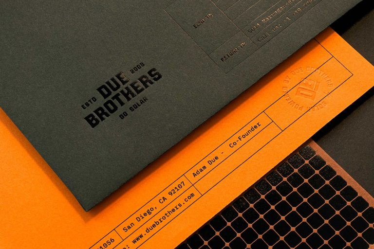
This brand identity created for Due Brothers construction displays a strong and professional look to the customer while still retaining the hard-working, blue-collar feel.
The company’s business cards stick with the construction orange & worn leather brown color scheme but tailor the cards to their company even more by adding a worn-in, debossing effect with “solar panels” on the backs of the cards, serving as a constant reminder of who they are and what they do.
While their logo sticks with a type-only approach, their light bulb icon will take center stage whenever their logo isn’t used.
The light bulb serves as an easily recognizable reference to the solar panels the company installs.