Many brands have switched over to the colorful packaging style to garner interest from the “Millennial” and “Gen Z” generations. One key example of that of the Byte Bars branding.
Up until a few years ago, a bright and bold design scheme could be a huge gamble.
Sometimes colors can deter consumers from purchasing one brand’s product over the other.
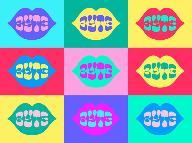
Nevertheless, the designers at Cast Iron Designs created a vibrant brand identity and packaging scheme. The design system consists of an alarming, vibrant color scheme. The colors take inspiration from the colorful 60’s style & the new wave pop-art style. Moreover, this aesthetic does a great job to align with the millennial age range and the generation’s interest in all things nostalgic.
The custom typeface used for the brand’s main logo is reminiscent of the organic, bubbly, lava-lamp style of the psychedelic era set in a two-dimensional illustration of lips.
This custom font matches up with the more legible font. They use a clearer font on the business cards and ingredient information sections to give the customer a better experience.
You can easily distinguish the illustration and brand name with the use of contrasting colors. This color system creates a simple yet extremely versatile icon that can be easily picked out from other products.
The Byte Bars branding and packaging design meet its goal by drawing the viewer’s eye in a fun and striking way.