The new Apotek1 branding made changes to include the new Metode+. An entirely new product style was created along with it, bringing forward new item packaging.
Overall, the new design language (designed by Goods) calls back to the classic 1950s and 1960’s design styles. The Apotek1 branding features soft, yet vibrant color schemes and simplistic typographical layouts.
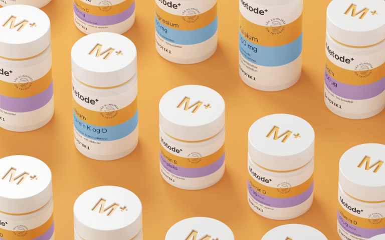
Each item that is offered under the brand’s name displays a basic, uniformed look containing a generic, white background and the same vertical, typographical hierarchy.
Typography
The sans-serif font possesses a semi-bold weight that makes the information large enough to read with ease but also not too bold so that it won’t distract the viewer from the packages other information telling elements.
The look is clean and straightforward and creates a high-end feel while still being generic, drugstore and pharmaceutical products.
Apotek1 Branding Color
Instead of relying on the written information to tell you what each product is, the Apotek1 branding separates each item using two varying color block systems.
The top ring of color will match up with the ‘field’ the product is in, like vitamins, shampoo, toothpaste, etc. and the bottom ring of color dives even deeper and separates each of those categories into doses, strengths, scents, etc.
This can make it easy for the consumer to easily recognize the item by color first and then holds their attention long enough to decide if the said product meets their needs and uses.