Humans have always turned to nature and other natural elements for engineering, agriculture, and design. When it came time to design the ALTO packaging, the design team at Paul Dunbar turned to nature and the basic simplicity of geometric designs to carry the brand’s message across to consumers.
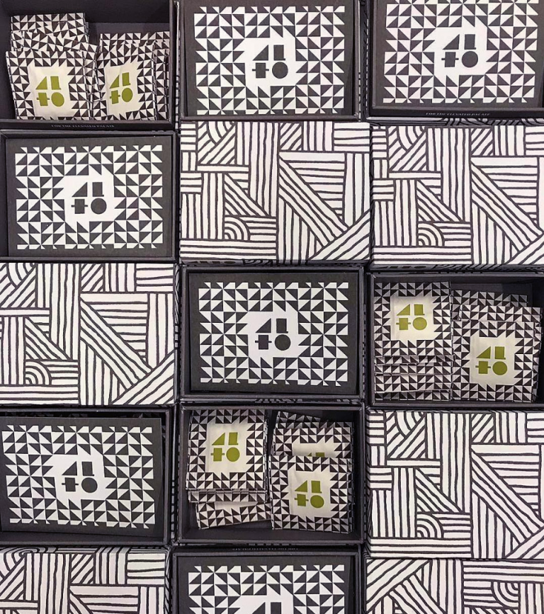
100% of the company’s packaging and branding relies on geometric shapes arranged into eye-catching, repetitive patterns. Despite the reliance on repetition, the patterns vary from product to product to help distinguish the items from one another. Moreover, this prevents the reliance on paragraphs of information and distracting typography which could overwhelm the viewer.
The limited use of text in the packaging comes from the brands name. The design notably follows the packaging’s use of shapes, forming the letters ‘A’ ‘L’ ‘T’ ‘O’ out of triangles, squares, rectangles, and circles.
Furthermore, this help set the brand’s name apart from the busy patterns, the designer’s used muted greens and blues.
The use of these colors against the stark, black and white color scheme of the background patterns offers a brief moment of release from the overwhelming yet elaborately simple remaining packaging design.
The ALTO packaging is a high-end, luxurious take on the commonly used natural design approach for cannabis related products.