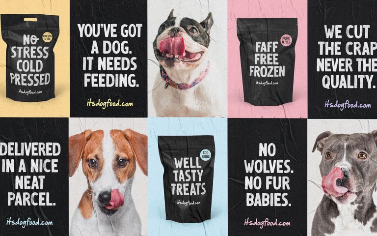
Take a look at this packaging from itsdogfood.com!
By using a majority black and white color scheme, containing no distinctive patterns, the brand was able to create a look that is easy to see and easy to read.
The heavy serif typeface is clear and organized but also possesses a handmade aesthetic that makes the brand more natural and approachable.
When the brand does use colors for their packaging (designed by Robot Food) they decide to use pastel hues so they can easily and subtly distinguish products from one another with ease.


