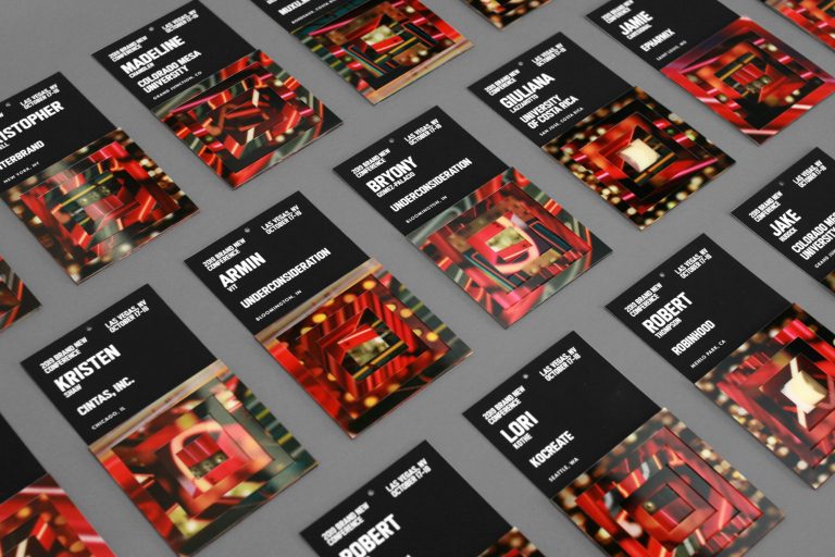
The Brand New Conference 2019 took a fun and energized design approach for the conference’s tenth anniversary.
Inspired by the bright lights of the Las Vegas Strip, the Brand New Conference 2019 team (Brand New) decided to center their event around a scaled-up look of the current city we’ve grown to know and recognize and transform it into the classic version of what the city once was, without losing its signature, modern, glitzy style.
By sticking with a compact and bold serif font, the conference designers were able to combine the letters with the colorful, neon images of the Las Vegas lights to create multiple, one-of-a-kind combinations without having to worry about the legibility of the letters.


