
Rite Aid Corporation announced in March of 2020 that it will be transitioning to a refreshed brand identity. The rebrand—as they claim—”attributes that resonate with Millenial & Gen X consumers.”
Previous Logo
The previous logo wasn’t necessarily memorable in the vein as CVS or Walgreens (their competitors), but it was a unique logo. The red & blue colors of the previous logo married nicely with the centered typography in a holding badge.
The Rite Aid brand team decided to go in a completely different direction with the logo: taking the type out of the badge & replacing it with a mortar and pestle.
Typography
The typography went in another questionable direction with a very Art Deco treatment (Neutraface).
The previous type had a very strong, affirmative demeanor. While it wasn’t perfect (that R could’ve used some love), it felt right for a pharmacy brand that needs to evoke a sense of confidence in its products. There is a reason plain-ole boring Helvetica is used for pharmaceuticals—consumers don’t want personality when they’re taking their medicine. They want consistency & reliability.
Colors
The (very ‘Murican) red & blue were replaced a slightly more saturated blue & lime green. It definitely signals a shift toward the aforementioned younger target consumer. Nevertheless, this particular color combo needs to have very strict background control in order to be effective which hurts.
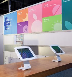
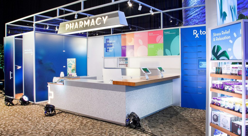
The only image of their logo usage comes on their pharmacy drive-thru kiosk image. To make matters worse for our review, it’s in a horizontal lock-up, without the icon, in white. It would be nice to see what their vision for logo deployment will be.
The Icon
As for the icon itself, it’s OKAY. At a glance, it looks like the width of the inner padding is the same as the width of their “I”; perhaps a bit bigger. Rite Aid’s decision to move with a mortar & pestle is an interesting one—as a Millenial myself I don’t think of a mortar & pestle to do with anything except crushing up some avocados for guacamole (pro-tip: use a potato masher instead). They couldn’t think of other imagery associated with “Rite” & “Aid”?
Placement & Livery
The livery is fine—the tile imagery seems kind of lazy to deploy icons with pastel colors, but they do their job to brighten up the scene. This feels like a play toward the very Millenial trend of simplistic monochromatic photography, which they have deployed on their points of sale displays. Why not scrap the icon system & lean all into the photography?
Above-all, this feels like a ‘new Creative Director’ type refresh, but without a lot of cohesiveness. Hopefully there will be more imagery to come out that reflects the Rite Aid brand identity living in multiple touchpoints.

