Over the years, styles have changed in favor of what’s popular in pop culture, politics, and our personal, day-to-day lives. One look that has barely changed in history is the modern aesthetic that we have grown to love and have tried so hard to achieve in our everyday style. The Porto Ferreira packaging executes this beautifully.
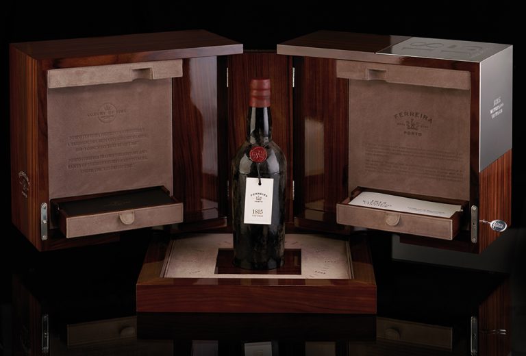
The Porto Ferreira packaging (designed by Omdesign) puts their Waterloo Wine look on full display with its dark, internationally sourced, sleek wood. Paired with a silver engraved panel, the packaging highlights the wine’s name and year.
The geometric, puzzle-box style packaging gives the box more of a stand-alone presence and can act as a decoration alongside what the packaging contains.
Under an engraved lock and key is the Porto Ferreira Waterloo wine. The Waterloo 1815 wine bottle was named and produced in the same year that the 1st Duke of Wellington defeated Napoleon Bonaparte’s army at the Battle of Waterloo. The bottle possesses the classic wax-seal style and bottle of the past and contains the highly rated wine.
The compliment this wine, the Porto Ferreira company modeled the information booklet and the accompanying texts of information in an old-fashioned, high-end, serif style font. The typography pairs well with the font used in the brands name and fits along with the luxurious exterior packaging.
The Porto Ferreira packaging design elevates its product to extraordinary levels and truly makes the recipient feel like a million dollars.