When a company decides to modernize their company, it’s always important that the company’s purpose and message is highlighted somewhere within their new logo or brand identity. Furthermore, when there’s an update made to the Peace Coffee identity, it has to check those boxes.
Peace Coffee is a Minneapolis-based organic coffee roaster dedicated to bringing quality coffee. The company has demonstrates social impact to benefit farmers from Central & South American and Africa—where they source their coffee beans from.
With this in mind, the Werner Design Werks company was tasked with updating their logo just enough that it looks brand new, but is still related to the branding that already existed.
The main icon for the Peace Coffee identity is their turtle, an animal which represents the ability to adapt and press on, at a steady pace, through the changes and tasks that they come across.
The bright red, tribal-inspired, illustration is easily recognizable and contains the company’s monogram “PC” within the decorative and eye-catching image.
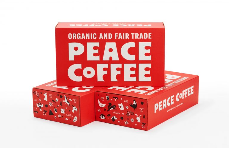
The accompanying typography is a funky, organic, somewhat hand-drawn font style with psychedelic qualities that ties into the homegrown, locally-sourced message that the brand pushes across.
Their new product packaging does away with the rough, and crowded hierarchy in favor of a simple red bag with the company’s name along with different colored squares of information distinguishing each coffee’s flavor.
This new layout is still bold and quirky but it looks more professional and clean cut. Overall, this re-branding breathes new life into the old identity while still holding on to the company’s unique style and message.