Package design is the foundation of any box or container’s effectiveness.
More than visual appearance, a great package design goes into the function of the container.
A great package designer takes into account how the consumer will experience opening the container, how it looks on a shelf, and how economically the size is in relation to the product.
Below is our selections for the best packaged designs of 2020.
The Best Package Design Examples
Native Body & Skin Packaging
Design Team
Shohida Rasulova
Industry
Health, Wellness and Fitness
This tropical rainforest brand identity for Native Body & Skin, created by design student Shohida Rasulova, brings the warm, jungle atmosphere to the everyday person
By using soft, pastel hues as the background colors, the accompanying custom typeface is accentuated against the brand’s colorful backdrop.
The fonts thin weight, capitalized type, and use of geometric icons play up the brand’s information to create a subtle, one-of-a-kind typeface.
Moss Package Design
The Moss package design possess both a quirky exterior as well as an eco-friendly material.
The exterior packaging (designed by Bacon Liu) is explosive in nature with its use of complementary color schemes, silver and gold foil stamping, and multiple different fonts to generate the maximum interest from the customer viewing it.
Using 70% recycled material for their brand’s packaging, Moss has achieved its goal of highlighting nature and its importance to even the busiest city person and giving them a little piece of it to enjoy.
MerryGo Spirits Label & Package Design
This packaging design from MerryGo Spirits takes us back to the classic Victorian elements of style and design.
Using multiple, varying fonts for different sections of information, the brand manages to create a cohesive layout that grabs the viewer’s attention without losing them to the chaos of the numerous typefaces & information.
Each spirit flavor’s packaging (designed by Canales & Co.) follows the same layout as one another but varies on color scheme depending on their flavor, creating a united design theme that still distinguishes products from one another.
Modesta Cassinello Cosmetics
Take a look at this artistic and intricate package design created for Modesta Cassinello Cosmetics. The simple, black, serif typeface looks clean and professional when placed on the stark white background color, but is made more distinct when placed next to the illustrative package designs.
The delicate and expressive drawings displayed on the packaging (designed by Plácida) help create a balanced composition surrounding the simplicity of nature and the natural, botanical aspect of the products’ ingredients.
Haus Holiday Packaging
This holiday packaging created for Haus captures the true spirit of the holidays by using a beautiful, illustrative style that is too distinct to warrant the use of wrapping paper.
The illustrations, created by Jing Wei and Jessica Hische, offer a dynamic range of designs across the multiple products the brand offers that will vary from total illustrations or typefaces to mixtures of the two.
By using a wide array of colors, the Haus holiday packaging and its accompanying illustrations are perfect for any holiday or any winter event.
Cho&co Packaging
With their use of bold geometric patterns & typefaces, the Cho&co packaging is a wonderful representation of traditional Art Deco style in the 21st century.
The soft yet impactful colors used for the packaging (designed by Melih Aydogmus) correspond with the popular color swatch selections of the time period while also coinciding with each chocolate bar’s flavor.
The traditional typeface is used in a wide array of formats and placements throughout the packaging, offering a dynamic & interesting look that also stays constant throughout each of the chocolate bars, giving the Cho&co packaging designs a distinct instance of uniformity.
Capitain Amberjack Packaging
The White Rum variant of Capitain Amberjack packaging uses a classic and simplistic design angle for their brand’s packaging. By pairing their custom, illustrated sailor icon alongside the products numerous different fonts and typefaces, the design creates a high-end, expensive look that will capture and hold the viewer’s attention.
Designed by Zahir Tarverdiyev, the Capitain Amberjack packaging exterior uses a white background, while most of the product information possesses a navy blue color and the remaining instances use a deep red.
By using the deep red for only the products name, specifically the ‘captain’ and ‘premium quality’ portions, the brand is able to highlight the items name amongst the rest of the information and illustrations in a way that still compliments those other elements as well, creating a well-balanced and cohesive layout.
The typefaces the Capitain Amberjack packaging uses will either follow a clean and bold sans-serif font or a customized, rough, hand-written style typeface.
The pairing of these two font styles brings together both sides of the sailing and sea-faring lifestyle in a symbolic resonance style; one of which being the strict, regimented, military lifestyle and the other being the rough, natural, and bold life.
By heavily relying on the illustrated sailor image to show the viewer that the brand centers on sailing and sailors, the typefaces do a great job of carrying that message even further to the viewer’s mindset.
Birdman Protein Packaging
By breaking away from the traditional, two-dimensional art style for their brand’s packaging in favor of a more modern and more expressive art style, the Birdman Protein packaging (designed by TS/D Agency) is a captivating packaging design that blends a minimalistic information layout with an intense and ornate icon.
The very first thing you see when you look at the Birdman Protein packaging is the colorful bird design that takes center-stage on the front of the container.
By using the deep red for only the products name, specifically the ‘captain’ and ‘premium quality’ portions, the brand is able to highlight the items name amongst the rest of the information and illustrations in a way that still compliments those other elements as well, creating a well-balanced and cohesive layout.
Using what seemed to be a three-dimensional design program to create their bird designs, the images look like they would extend beyond the smooth exterior of the product tin due to their use of shading, highlights, and lowlights but they don’t, making the design truly spectacular and one-of-a-kind.
The birds not only act as attention-grabbing icons but also serve as the distinguishing factor between each product.
Each bird represents a protein product and each corresponding bird will vary by color slightly to help differentiate each products flavor.
Right alongside the iconography and the bold, colorful background is a lightweight, narrow, sans-serif typeface displaying the brand’s name, the product name, and the important, corresponding information about the product’s ingredients.
The delicate text stands out against the solid color background but doesn’t outshine the bold bird icon and instead compliments it in a subtle way.
Samurai Japanese Restaurant Concept
It’s not always easy to combine fun, eye-catching product packaging with convenience and practicality for a restaurant concept. However, when the two come together you end up with one of a kind design that can become a restaurant concept’s signature style.
The brand and packaging design created for a restaurant concept by a group of Swedish design students sees functional and playful designs take center stage with the use of playful and colorful designs used as an homage to Japanese art and culture.
The design sees a wide array of colors used in various shapes and patterns.
These patterns still maintain a controlled and balanced composition by keeping most of the larger color sections in pastel pinks and purples so that the busy pattern and bolder colors don’t overwhelm the viewer with too much to look at.
With all of the colorful chaos occurring on the packaging, the brand is balanced out by its use of a simple typeface.
By using a classic sans-serif font on blank white or light pink backgrounds to relay the restaurant concept’s name and the menu’s item information, the brand is able to display important information about the brand to the viewer without having to worry about the energetic visuals on the external packaging.
The structural design of the carry-out containers was made to help make the consumers life much simpler.
The boxes contain handles at the top of the containers along with slots on the sides so that the customer can stack their numerous boxes of food, latch them together, and carry them in one hand with ease.
Apotek1 Branding & Packaging
The new Apotek1 branding made changes to include the new Metode+. An entirely new product style was created along with it, bringing forward new item packaging.
Overall, the new design language (designed by Goods) calls back to the classic 1950s and 1960’s design styles. The Apotek1 branding features soft, yet vibrant color schemes and simplistic typographical layouts.
Each item that is offered under the brand’s name displays a basic, uniformed look containing a generic, white background and the same vertical, typographical hierarchy.
The sans-serif font possesses a semi-bold weight that makes the information large enough to read with ease but also not too bold so that it won’t distract the viewer from the packages other information telling elements.
The look is clean and straightforward and creates a high-end feel while still being generic, drugstore and pharmaceutical products.
Instead of relying on the written information to tell you what each product is, the Apotek1 branding separates each item using two varying color block systems.
The top ring of color will match up with the ‘field’ the product is in, like vitamins, shampoo, toothpaste, etc. and the bottom ring of color dives even deeper and separates each of those categories into doses, strengths, scents, etc.
This can make it easy for the consumer to easily recognize the item by color first and then holds their attention long enough to decide if the said product meets their needs and uses.
Peace Coffee Identity & Package Design
When a company decides to modernize their company, it’s always important that the company’s purpose and message is highlighted somewhere within their new logo or brand identity. Furthermore, when there’s an update made to the Peace Coffee identity, it has to check those boxes.
Peace Coffee is a Minneapolis-based organic coffee roaster dedicated to bringing quality coffee. The company has demonstrates social impact to benefit farmers from Central & South American and Africa—where they source their coffee beans from.
With this in mind, the Werner Design Werks company was tasked with updating their logo just enough that it looks brand new, but is still related to the branding that already existed.
The main icon for the Peace Coffee identity is their turtle, an animal which represents the ability to adapt and press on, at a steady pace, through the changes and tasks that they come across.
The bright red, tribal-inspired, illustration is easily recognizable and contains the company’s monogram “PC” within the decorative and eye-catching image.
The accompanying typography is a funky, organic, somewhat hand-drawn font style with psychedelic qualities that ties into the homegrown, locally-sourced message that the brand pushes across.
Their new product packaging does away with the rough, and crowded hierarchy in favor of a simple red bag with the company’s name along with different colored squares of information distinguishing each coffee’s flavor.
This new layout is still bold and quirky but it looks more professional and clean cut. Overall, this re-branding breathes new life into the old identity while still holding on to the company’s unique style and message.
Porto Ferreira Package Design
Over the years, styles have changed in favor of what’s popular in pop culture, politics, and our personal, day-to-day lives. One look that has barely changed in history is the modern aesthetic that we have grown to love and have tried so hard to achieve in our everyday style. The Porto Ferreira packaging executes this beautifully.
The Porto Ferreira packaging (designed by Omdesign) puts their Waterloo Wine look on full display with its dark, internationally sourced, sleek wood. Paired with a silver engraved panel, the packaging highlights the wine’s name and year.
The geometric, puzzle-box style packaging gives the box more of a stand-alone presence and can act as a decoration alongside what the packaging contains.
Under an engraved lock and key is the Porto Ferreira Waterloo wine. The Waterloo 1815 wine bottle was named and produced in the same year that the 1st Duke of Wellington defeated Napoleon Bonaparte’s army at the Battle of Waterloo. The bottle possesses the classic wax-seal style and bottle of the past and contains the highly rated wine.
The compliment this wine, the Porto Ferreira company modeled the information booklet and the accompanying texts of information in an old-fashioned, high-end, serif style font. The typography pairs well with the font used in the brands name and fits along with the luxurious exterior packaging.
The Porto Ferreira packaging design elevates its product to extraordinary levels and truly makes the recipient feel like a million dollars.
Guta Café Rebranding & Merch
This Guta Café rebranding is a perfect example of showcasing ones culture. This relates well to the general public, while also supplying their goods and services. Guta Café provides strong Vietnamese “street- coffee” which has become a foundation to the country’s local culture.
Many brands choose to focus on only displaying their message and purpose through their packaging, while others choose to let their countries culture and style shine through their packaging and identity designs show and relate to the local community who will be consuming their products.
Guta Café Rebranding Background
Guta is Vietnamese slang that combines the French word “Gu” and the Vietnamese word “Ta”. When the two are combined, it translates to “our style”. Guta Café’s style is a unique and one-of-a-kind style that is reflected throughout the company’s branding in a way that reflects multiple Vietnamese pop culture icons.
The Guta Café rebranding design style (made by M — N Associates) contains a vivid bright blue and yellow color scheme. The basis for the scheme is modeled after the Vietnamese Social Security propaganda poster that became a recognizable image from Vietnamese culture. The goal was to represent the poster’s message which was “a friend of every worker”.
The images printed on their coffee cups are modeled after the half-tone printing style. The half-tone texture is used for newspapers and fits within that propaganda posters message. These visualizations were meant to act as a bridge that connects different people, from all walks of life who come together to sit down and have a cup of coffee with their morning newspaper.
The typography that is used for multiple components of the brands items is reflective of the commonplace font that is used across multiple forms of media throughout Vietnam.
The Guta brand identity shows the best of what Vietnam has to offer and is a cultural mainstay for the country and its residents.
Harbor Crafts Package Design
A brands name can be just as important to its identity, packaging design, and its overall outward aesthetic. The mock Harbor Crafts “company” was designed by Chargefield for Adobe to help showcase Adobe’s program called Adobe Dimension.
The Harbor Crafts Company sells high-end accessories for men which includes belts, cuff-links, shoes, and especially ties.
The designers made a sleek and simple creation that reflects the brands products, and the brands name.
The Harbor Crafts logo is a bold and heavy-set, serif typeface that is split apart by the brands icon. Usually when this is done, it can break up the brands name too much and can distract the viewer from important information. That said, the icon is bold like the logo’s accompanying typeface.
It contains a blended “H” and “C” that are joined together through different sections of an anchor. This ties in the “harbor” theme perfectly & is set in a gold foil-stamp print. The foil pops and breaks away from the neutral navy background of the box.
The dark, navy blue background symbolizes the dark ocean and contains a faint, rippled, organic lines which represents the different levels of the ocean floor.
While this brand and packaging was only made to display Adobes different design systems, this identity was so well done that it makes you wish that the brand and its products existed in real life.
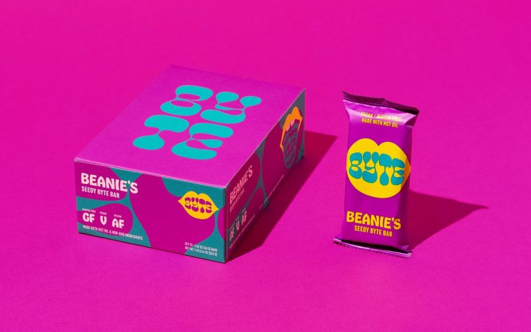
Byte Bars Branding & Package Design
Many brands have switched over to the colorful packaging style to garner interest from the “Millennial” and “Gen Z” generations. One key example of that of the Byte Bars branding.
Up until a few years ago a bright and bold design scheme could be a huge gamble.
Sometimes colors can deter consumers from purchasing one brands product over the other.
The designers at Cast Iron Designs created a vibrant brand identity and packaging scheme. The design system consists of an alarming, vibrant color scheme. The colors takes inspiration from the colorful 60’s style & the new wave pop-art style. This aesthetic does a great job to align with the millennial age range and the generations interest in all things nostalgic.
The custom typeface used for the brands main logo is reminiscent of the organic, bubbly, lava-lamp style of the psychedelic era set in a two-dimensional illustration of lips.
This custom font matches up with the more legible font. The more-clear font is used on the brands business cards and ingredient information sections.
The illustration and brand name are distinguished from one another by the use of contrasting colors. This color system creates a simple yet extremely versatile icon that can be easily picked out from other products.
The Byte Bars branding and packaging design meets its goal by drawing the viewer’s eye in a fun and striking way.
Alto Packaging
Humans have always turned to nature and other natural elements for engineering, agriculture, and design. When it came time to design the ALTO packaging, the design team at Paul Dunbar turned to nature and the basic simplicity of geometric designs to carry the brand’s message across to consumers.
100% of the company’s packaging and branding relies on geometric shapes arranged into eye-catching, repetitive patterns. Despite the reliance on repitition, the patterns vary from product to product to help distinguish the items from one another. The prevents the reliance on paragraphs of information and distracting typography which could overwhelm the viewer.
The limited use of text in the packaging comes from the brands name. The design notably follows the packaging’s use of shapes, forming the letters ‘A’ ‘L’ ‘T’ ‘O’ out of triangles, squares, rectangles, and circles.
The help set the brand’s name apart from the busy patterns, the designer’s used muted greens and blues.
The use of these colors against the stark, black and white color scheme of the background patterns offers a brief moment of release from the overwhelming yet elaborately simple remaining packaging design.
The ALTO packaging is a high-end, luxurious take on the commonly used natural design approach for cannabis related products.