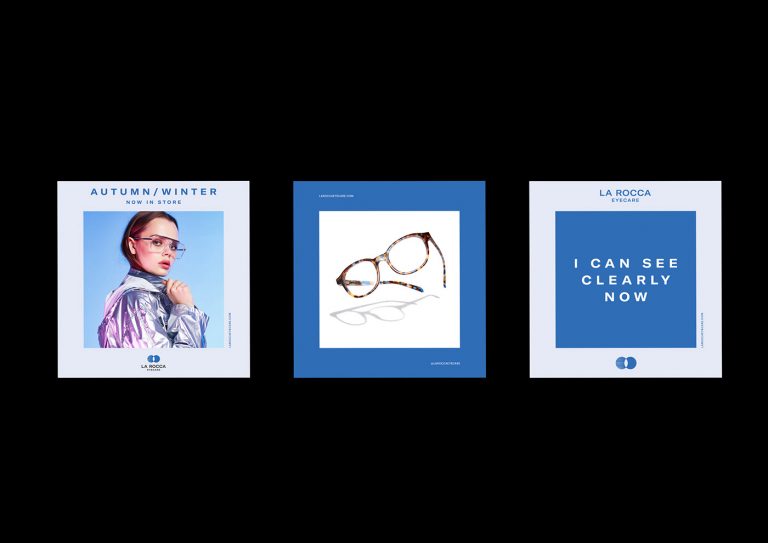
This clear and organized brand identity from La Rocca Eyecare blends a professional design aesthetic (by Mai Creative) while still pairing with the eye care business it represents.
The icon, while very generalized and simple, ties in with the company’s business by symbolically portraying eyes or eyeglasses.
It is also an icon that still has the potential to stand on its own without the company’s name and still be recognizable.
The use of a white and blue color scheme creates a clean look that is easy to follow alongside the addition of a bold & black serif typeface.