Parámetro Studio recently designed the Doer brand identity. Doer is a Mexican hardware store.
The identity itself resembles something as if Google were to make hardware tools brand.
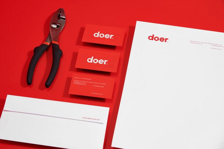
Between simple sans-serif typography, icon-heavy compositions, and flat, vibrant colors, the Doer brand identity is pleasant in every minimalist way.
The iconography is heavily geometric, with very little stroke/lines in play. This plays well against the solid color floods.
The typography is the epitome of minimalist—a safe, predictable layup of a geometric san-serif.
The colors of the Doer brand identity are red, yellow, and green—an ode (I think) to the Mexican flag & the heritage overall.
It would have been nice to see a bit more of the hispanic culture come through in the typography or something, but it works in its subdued simplicity.
That’s all good & great, but I inherently question the relevance.
Is this something Hispanic blue collar types gravitate towards? Part of designing a brand is to make sure that the overall message comes across—what’s the message here? That the buying & user experience is simple? That they’re aimed at more millennial, techy types of people?
I do not know the answer to these questions.
All told, I think the identity is superbly executed, but one has to question if that execution is on-target.