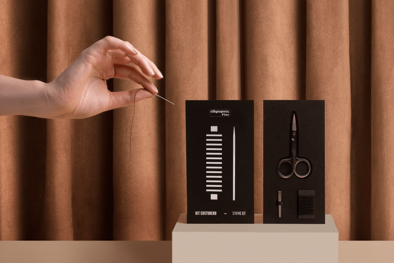
City Express Plus is an international hotel chain whose branding follows a modern, simplistic design that doesn’t sacrifice style or individuality.
The black and white color scheme, when combined with an eye-catching, sans-serif font, benefits a unique corporate setting and experience.
By centering their branding around typography instead of colors and patterns, they are able to give clear instructions to important functions within the business while still sticking to an overall theme (designed by Futura).
The plain, geometric packaging and basic illustrations give the City Express Plus products a high-end feel that doesn’t overwhelm the viewer while also matching the overall aesthetic of the business as well.