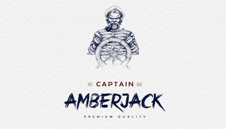
The White Rum variant of Capitain Amberjack packaging uses a classic and simplistic design angle for their brand’s packaging. By pairing their custom, illustrated sailor icon alongside the products numerous different fonts and typefaces, the design creates a high-end, expensive look that will capture and hold the viewer’s attention.
Designed by Zahir Tarverdiyev, the Capitain Amberjack packaging exterior uses a white background, while most of the product information possesses a navy blue color and the remaining instances use a deep red.
By using the deep red for only the products name, specifically the ‘captain’ and ‘premium quality’ portions, the brand is able to highlight the items name amongst the rest of the information and illustrations in a way that still compliments those other elements as well, creating a well-balanced and cohesive layout.
The typefaces the Capitain Amberjack packaging uses will either follow a clean and bold sans-serif font or a customized, rough, hand-written style typeface.
The pairing of these two font styles brings together both sides of the sailing and sea-faring lifestyle in a symbolic resonance style; one of which being the strict, regimented, military lifestyle and the other being the rough, natural, and bold life.
By heavily relying on the illustrated sailor image to show the viewer that the brand centers on sailing and sailors, the typefaces do a great job of carrying that message even further to the viewer’s mindset.