Creating & managing a company’s brand identity is the foremost priorities of a marketing manager.
When you see a brand identity that has an amazing design language to it, it’s sometimes difficult to diagnose what makes it so great.
In this article, we go over some of the top brand identities released in 2020.
We’ll also explain the good & bad design/marketing decisions for each brand.
13 Creative Brand Identity Examples
Slice Beer Co. Branding & Merchandise
Design Team
Unknown
Industry
Retail
Rite Aid Brand Identity
Design Team
Unknown
Industry
Retail
Rite Aid Corporation announced in March of 2020 that it will be transitioning to a refreshed brand identity. The rebrand—as they claim—”attributes that resonate with Millenial & Gen X consumers.”
The typography went in another questionable direction with a very Art Deco treatment (Neutraface).
The previous type had a very strong, affirmative demeanor. While it wasn’t perfect (that R could’ve used some love), it felt right for a pharmacy brand that needs to evoke a sense of confidence in its products. There is a reason plain-ole boring Helvetica is used for pharmaceuticals—consumers don’t want personality when they’re taking their medicine. They want consistency & reliability.
The (very ‘Murican) red & blue were replaced a slightly more saturated blue & lime green. It definitely signals a shift toward the aforementioned younger target consumer. Nevertheless, this particular color combo needs to have very strict background control in order to be effective which hurts.
The only image of their logo usage comes on their pharmacy drive-thru kiosk image. To make matters worse for our review, it’s in a horizontal lock-up, without the icon, in white. It would be nice to see what their vision for logo deployment will be.
As for the icon itself, it’s OKAY. At a glance, it looks like the width of the inner padding is the same as the width of their “I”; perhaps a bit bigger. Rite Aid’s decision to move with a mortar & pestle is an interesting one—as a Millenial myself I don’t think of a mortar & pestle to do with anything except crushing up some avocados for guacamole (pro-tip: use a potato masher instead). They couldn’t think of other imagery associated with “Rite” & “Aid”?
The livery is fine—the tile imagery seems kind of lazy to deploy icons with pastel colors, but they do their job to brighten up the scene. This feels like a play toward the very Millenial trend of simplistic monochromatic photography, which they have deployed on their points of sale displays. Why not scrap the icon system & lean all into the photography?
Above-all, this feels like a ‘new Creative Director’ type refresh, but without a lot of cohesiveness. Hopefully there will be more imagery to come out that reflects the Rite Aid brand identity living in multiple touchpoints.
Eventbrite Branding
For an events-based company like Eventbrite, branding has to be on-point. The updated Eventbrite Branding shows the importance of cohesiveness, with the help of Moving Brands.
Even in this weird, COVID-19 ridden world, events are still very much a thing. Many publication-forward brands (particularly blogs) make their money on in-person events. With their marketing talent, I’m sure they’ll figure out how to hold events in this era of social distancing.
Anyway, back to the Eventbrite branding review.
The refresh is largely typographic in nature, but there really isn’t any one thing that unites the brand together.
Typically, brand refreshes have something that pulls everything together. There is always one element that you can look to and say “this is what brings everything under one roof.”
There really isn’t that one combining element, unless you really stretch it to say it’s the Eventbrite staple reddish orange. Looking at the poster imagery & even some interfaces below, that orange isn’t there to pull them together.
That said, everything feels cohesive. There isn’t one brand language northstar. Instead, there’s a combination of other consistent elements (typography, color palette, visual language, etc) that makes everything feel connected.
It’s the very definition of a cohesive-yet-loose brand language…an in-house designer’s dream.
I think a small win to pull everything together, yet keep everything open to interpretation would be to apply the orange transitional ‘e’ icon somewhere on each touchpoint, somewhere. This approach is similar to how Spotify places their green/white little sound icon everywhere in a delicate way.
Either way, I think this is a well-designed refresh for a brand that needs every bit of help they can get in these times.
Doer Brand Identity
Parámetro Studio recently designed the Doer brand identity. Doer is a Mexican hardware store.
The identity itself resembles something as if Google were to make hardware tools brand.
Between simple sans-serif typography, icon-heavy compositions, and flat, vibrant colors, the Doer brand identity is pleasant in every minimalist way.
The iconography is heavily geometric, with very little stroke/lines in play. This plays well against the solid color floods.
The typography is the epitome of minimalist—a safe, predictable layup of a geometric san-serif.
The colors of the Doer brand identity are red, yellow, and green—an ode (I think) to the Mexican flag & the heritage overall.
It would have been nice to see a bit more of the hispanic culture come through in the typography or something, but it works in its subdued simplicity.
That’s all good & great, but I inherently question the relevance.
Is this something Hispanic blue collar types gravitate towards? Part of designing a brand is to make sure that the overall message comes across—what’s the message here? That the buying & user experience is simple? That they’re aimed at more millennial, techy types of people?
I do not know the answer to these questions.
All told, I think the identity is superbly executed, but one has to question if that execution is on-target.
Milwaukee Brewers Identity & Uniforms
When it comes to a small-market team like the Milwaukee Brewers, identity needs to be refined & clear.
Baseball is considered an iconic sport in the United States and is often referred to as “the American Pastime”.
With this nostalgic tagline forever adhered to the sport’s image, it can be hard to evolve a team’s look without losing the classic look and style that fans had come to associate with the brand.
This was the task that the members of the RARE Design studio were tasked with when it came to re-branding one of the oldest baseball teams in America.
The design team approached the rebranding by giving previously used and retired images and icons of the brand a modern-day refresh.
The team’s main logo was changed by making the “Milwaukee Mitt’s” baseball center a true representation of a Midwestern staple; wheat.
By making the wheat baseball the true center of attention, the brand created a new and better icon for the team and the Midwest as a whole
The Milwaukee Brewers identity also stuck with a lot of the brand’s familiar icons, like the Milwaukee State Art, and gave them a 21st-century update with the use of more colors and a more clean and vectored artwork style.
The traditional sports-serif font style and the tam’s modern heritage word mark were customized and cleaned up by the designers to help create a fresher and more sleek word mark for the team that will stand-out and compliment the team’s variety of uniforms.
This Milwaukee Brewers identity re-branding blends together the old-school familiarity of baseball but modernizes it for today’s target audience.
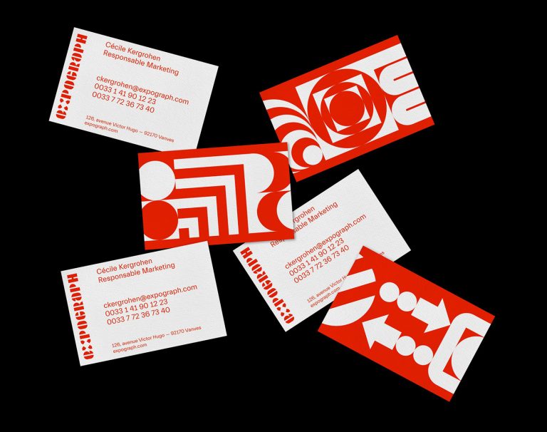
Expograph Brand Identity
This vibrant & expressive design for Expograph is brought to a whole new level of design with its wide array of patterns, its quirky typefaces, and it’s alarming red color scheme.
The harsh geometric tone of the brand’s illustrations offers an unlimited combination of clean, razor-sharp patterns that pair well with the other elements of the brand’s identity.
By using a retro-style typeface for the brand’s logo, the designers (Brand Brothers) were able to make a unique and bubbly look that is also practical, legible, and distinct.
Due Brothers Brand Identity
This brand identity created for Due Brothers construction displays a strong and professional look to the customer while still retaining the hard-working, blue-collar feel.
The company’s business cards stick with the construction orange & worn leather brown color scheme but tailor the cards to their company even more by adding a worn-in, debossing effect with “solar panels” on the backs of the cards, serving as a constant reminder of who they are and what they do.
While their logo sticks with a type-only approach, their light bulb icon will take center stage whenever their logo isn’t used.
The light bulb serves as an easily recognizable reference to the solar panels the company installs.
Hotel Arlberg Lech Brand Identity
This elegant brand identity created for the Hotel Arlberg Lech perfectly portrays the classic, high-end ski resort we come to think of when we think of Austrian winters.
The brand’s organic, cursive typeface curves & bends to match the hotels accompanying ski slopes.
The color scheme sticks to a majority black, white, and evergreen green color scheme to reflect the terrain of the mountains with splashes of gold to add a touch of high-class luxury to the brand (designed by Bureau Rabensteiner).
The brand’s simplistic illustrations unite function & fun by displaying important weather information with a modern and exciting design.
La Rocca Eyecare Branding
This clear and organized brand identity from La Rocca Eyecare blends a professional design aesthetic (by Mai Creative) while still pairing with the eye care business it represents.
The icon, while very generalized and simple, ties in with the company’s business by symbolically portraying eyes or eyeglasses.
It is also an icon that still has the potential to stand on its own without the company’s name and still be recognizable.
The use of a white and blue color scheme creates a clean look that is easy to follow alongside the addition of a bold & black serif typeface.
Muteza Brand Identity
Take a look at this Muteza brand identity, created by VVORKROOM for designer Domenico de Palo and his furnishing designs and other home decor products.
This identity blends together a historic, sans-serif style typeface, a velvet red color scheme, and pops of marble accents to create a brand reminiscent of the Ancient Roman era or the classic Italian Renaissance style.
Nomart Brand Design
Take a look at this Muteza brand identity, created by VVORKROOM for designer Domenico de Palo and his furnishing designs and other home decor products.
This identity blends together a historic, sans-serif style typeface, a velvet red color scheme, and pops of marble accents to create a brand reminiscent of the Ancient Roman era or the classic Italian Renaissance style.
Mylko Brand Identity Design
The Maison Il Conservatorio branding created by Marco Calignano brings together the traditional Mediterranean style with a modern approach to create a simple yet eye-catching look for the Maison Il Conservatorio Sorrento hotel.
By centering the identity around a minimalist layout, the bright, blue-violet hue, quirky sans-serif font, and varying geometric patterns are given the chance to elevate the brand and separate the company from others in the field.
Maison Il Conservatorio Branding
The Maison Il Conservatorio branding created by Marco Calignano brings together the traditional Mediterranean style with a modern approach to create a simple yet eye-catching look for the Maison Il Conservatorio Sorrento hotel.
By centering the identity around a minimalist layout, the bright, blue-violet hue, quirky sans-serif font, and varying geometric patterns are given the chance to elevate the brand and separate the company from others in the field.