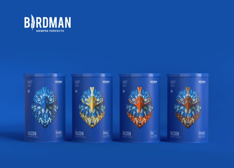
By breaking away from the traditional, two-dimensional art style for their brand’s packaging in favor of a more modern and more expressive art style, the Birdman Protein packaging (designed by TS/D Agency) is a captivating packaging design that blends a minimalistic information layout with an intense and ornate icon.
The very first thing you see when you look at the Birdman Protein packaging is the colorful bird design that takes center-stage on the front of the container.
By using the deep red for only the products name, specifically the ‘captain’ and ‘premium quality’ portions, the brand is able to highlight the items name amongst the rest of the information and illustrations in a way that still compliments those other elements as well, creating a well-balanced and cohesive layout.
Using what seemed to be a three-dimensional design program to create their bird designs, the images look like they would extend beyond the smooth exterior of the product tin due to their use of shading, highlights, and lowlights but they don’t, making the design truly spectacular and one-of-a-kind.
The birds not only act as attention-grabbing icons but also serve as the distinguishing factor between each product.
Each bird represents a protein product and each corresponding bird will vary by color slightly to help differentiate each products flavor.
Right alongside the iconography and the bold, colorful background is a lightweight, narrow, sans-serif typeface displaying the brand’s name, the product name, and the important, corresponding information about the product’s ingredients.
The delicate text stands out against the solid color background but doesn’t outshine the bold bird icon and instead compliments it in a subtle way.